
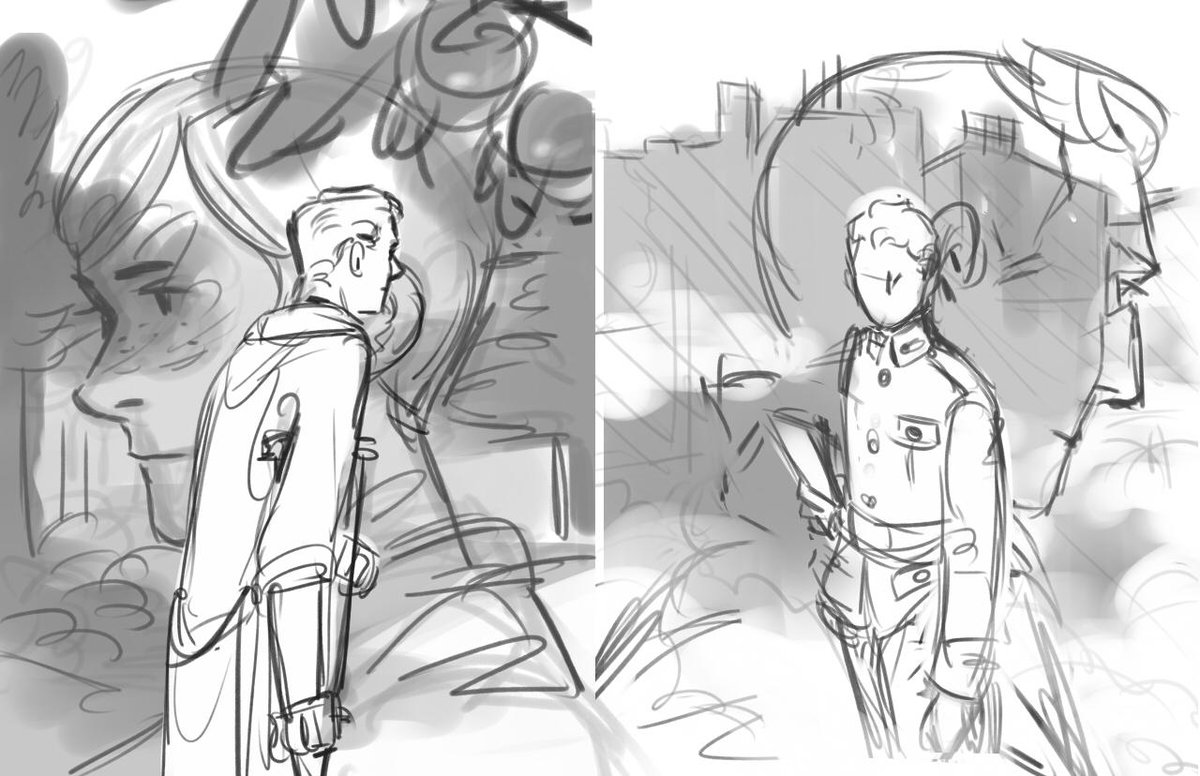
1. thumbnails. i decide early on that big floating heads are a sure compositional win. everyone likes big floating heads.
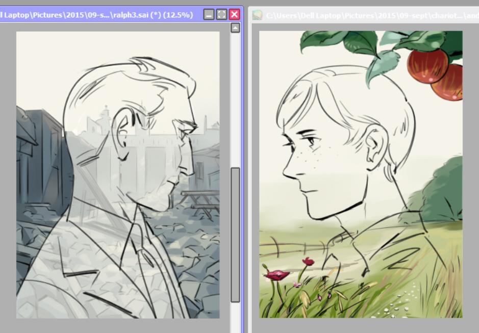
2. intermission. at this point i realize i can't draw any of the backgrounds i set myself up for. cue research (incl colour studies of two screen grabs from atonement, one of which i ended up carrying through to the final piece)

3. backgrounds. now i can draw english fields and nondescript rubble ¯\_(ツ)_/¯

4. time to add in floating heads. i erase and mist out half the backgrounds when i realize the elements in them are going to clash with the floating heads.
c'est la vie ¯\_(ツ)_/¯ ¯\_(ツ)_/¯ ¯\_(ツ)_/¯
(i also briefly consider making the heads kiss)
5. colour, plus lauries. (he's sort of important.)

6. text. voila!
higher-res files on my tumblr!
new art
Date: 2015-09-21 05:42 pm (UTC)Re: new art
Date: 2015-09-21 11:19 pm (UTC)no subject
Date: 2015-09-22 05:20 am (UTC)no subject
Date: 2015-09-22 05:41 pm (UTC)jk, but thank you! the first edition hardcover makes up for the rest, imo.
no subject
Date: 2015-09-25 08:30 pm (UTC)no subject
Date: 2015-09-26 04:52 am (UTC)As to your interpretation, i don't disagree-- it's partially out of convenience that i set up scenes and colours the way i do. A lot of the action takes place in small dingy rooms and crowded, public spaces-- both of which are a pain to draw (lol)
But I also get a sense of the story transcending all that claustrophobia, which is why I latch onto the rare vibrant scenes with "sun and rain and fresh air", as Ralph might say :)
no subject
Date: 2015-09-26 07:03 pm (UTC)