
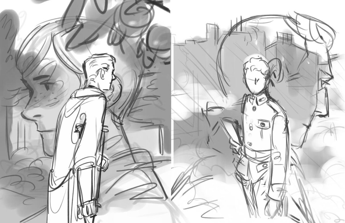
1. thumbnails. i decide early on that big floating heads are a sure compositional win. everyone likes big floating heads.
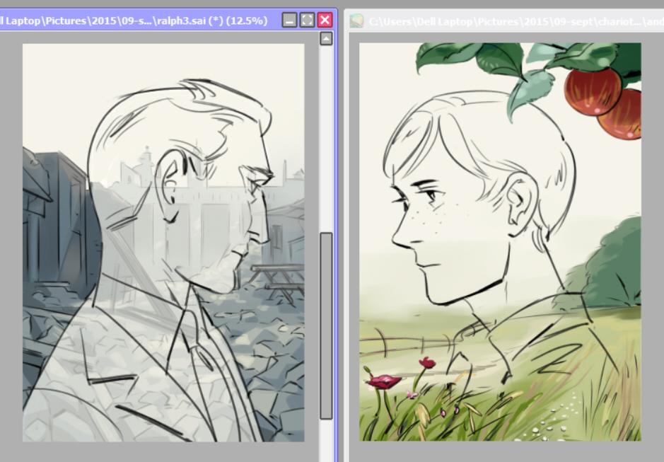
2. intermission. at this point i realize i can't draw any of the backgrounds i set myself up for. cue research (incl colour studies of two screen grabs from atonement, one of which i ended up carrying through to the final piece)

3. backgrounds. now i can draw english fields and nondescript rubble ¯\_(ツ)_/¯

4. time to add in floating heads. i erase and mist out half the backgrounds when i realize the elements in them are going to clash with the floating heads.
c'est la vie ¯\_(ツ)_/¯ ¯\_(ツ)_/¯ ¯\_(ツ)_/¯
(i also briefly consider making the heads kiss)
5. colour, plus lauries. (he's sort of important.)

6. text. voila!
higher-res files on my tumblr!